グラフにタイトルつけたいなーっていうときもあると思うので、これまでにも描いた棒グラフにタイトルをつけてみたいと思います。データは毎度おなじみirisです。
# 使用するパッケージの読み込み
library( ggplot2 )

# グラフの基本設定
ggplot() + theme_set( theme_classic(base_size = 12, base_family = "Hiragino Kaku Gothic Pro W3") )

# 描画
b <- ggplot( iris, aes( x = Species, y = Petal.Length, fill = Species ) ) +
  geom_bar( position = position_dodge( width = .9), stat = "summary", fun = "mean", alpha = .5 ) +
  geom_point( aes( color = Species ), size = .2, shape = 21, stroke = 1 ) +
  stat_summary( fun.data = "mean_se", geom = "errorbar", width = .2) +
  labs(x = "品種", y = "花びらの長さ", title = "a" ) +
  scale_y_continuous( breaks = c( 0, 2, 4, 6, 8 ), limits = c( 0, 8 ) ) +
  theme( legend.position = "none" )

plot( b )
グラフにタイトルをつけたいときは、「labs(x = “品種”, y = “花びらの長さ”, title = “a” )」のように書いてみてください。そうすると、
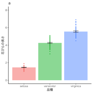
こんな感じでタイトルがつきます。
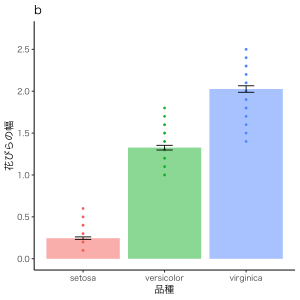
あるいは、
b2 <- ggplot( iris, aes( x = Species, y = Petal.Width, fill = Species ) ) +
  geom_bar( position = position_dodge( width = .9), stat = "summary", fun.y = "mean", alpha = .5 ) +
  geom_point( aes( color = Species ), size = .2, shape = 21, stroke = 1 ) +
  stat_summary( fun.data = "mean_se", geom = "errorbar", width = .2) +
  xlab( "品種" ) +
  ylab( "花びらの幅" ) +
  ggtitle( "b" ) +
  scale_y_continuous( breaks = c( 0, 0.5, 1.0, 1.5, 2.0, 2.5 ), limits = c( 0, 2.7 ) ) +
  theme( legend.position = "none" )

plot( b2 )
このように、「xlab( “品種” ) + ylab( “花びらの幅” ) + ggtitle( “b” ) 」のように書いても同じようにタイトルがつきます。
ね。
こうやってタイトルをつけることができると、
# 使用するパッケージの読み込み
library( ggplot2 )
library( gridExtra )

# グラフの基本設定
ggplot() + theme_set( theme_classic(base_size = 12, base_family = "Hiragino Kaku Gothic Pro W3") )

# 描画
b <- ggplot( iris, aes( x = Species, y = Petal.Length, fill = Species ) ) +
  geom_bar( position = position_dodge( width = .9), stat = "summary", fun.y = "mean", alpha = .5 ) +
  geom_point( aes( color = Species ), size = .2, shape = 21, stroke = 1 ) +
  stat_summary( fun.data = "mean_se", geom = "errorbar", width = .2) +
  labs(x = "品種", y = "花びらの長さ", title = "a" ) +
  scale_y_continuous( breaks = c( 0, 2, 4, 6, 8 ), limits = c( 0, 8 ) ) +
  theme( legend.position = "none" )

b2 <- ggplot( iris, aes( x = Species, y = Petal.Width, fill = Species ) ) +
  geom_bar( position = position_dodge( width = .9), stat = "summary", fun.y = "mean", alpha = .5 ) +
  geom_point( aes( color = Species ), size = .2, shape = 21, stroke = 1 ) +
  stat_summary( fun.data = "mean_se", geom = "errorbar", width = .2) +
  xlab( "品種" ) +
  ylab( "花びらの幅" ) +
  ggtitle( "b" ) +
  scale_y_continuous( breaks = c( 0, 0.5, 1.0, 1.5, 2.0, 2.5 ), limits = c( 0, 2.7 ) ) +
  theme( legend.position = "none" )

# bとb2を2列に並べる
b3 = grid.arrange( b, b2, ncol = 2 )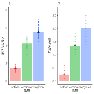
こういう図ができるので、
「Figure 1. 品種ごとの花びらの長さ(a)と幅(b)。エラーバーは標準誤差を示している」
みたいなキャプションをつけることができちゃいます。図表番号の節約と言いますか、図だらけになるのを抑えられるかなと思います。紙面には限りがあるのでね。
以上、タイトルのつけ方でした。