ggplotメモシリーズの序盤で散布図を書きました。
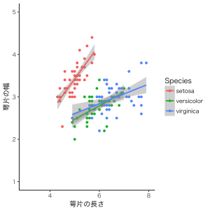
こういうやつです。
今回は、Speciesごとに分けてプロットする方法を紹介します(※今回は散布図で描きますが、他のタイプのグラフでもできます)。
# ggplot2の読み込み
library( ggplot2 )

# グラフの基本設定
ggplot() + theme_set( theme_classic(base_size = 12, base_family = "Hiragino Kaku Gothic Pro W3") )

# 描画2
g2 <- ggplot( iris, aes( x = Sepal.Length, y = Sepal.Width ) ) +
  geom_point() +
  xlab( "萼片の長さ" ) +
  ylab( "萼片の幅" ) +
  geom_smooth( method = "lm" ) + # 近似線は回帰法によって求める
  scale_x_continuous( breaks = c( 4, 6, 8 ), limits = c( 3, 8 ) ) +
  scale_y_continuous( breaks = c( 2, 3, 4 ), limits = c( 2, 4.5 ) ) +
  facet_grid( ~ Species )

plot( g2 )
最後の「facet_grid( ~ Species )」が、グラフをSpeciesごとに分けることを指示するための文です。その1文を付け加えてやることで、以下のような図ができます。
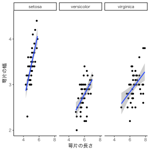
先に載せた図では3つのSpeciesがまとめてプロットされていましたが、ここでは別々にプロットされました。
Speciesの並び順は、デフォルトではアルファベット順になります。アルファベット順デフォは、横軸に条件名などがくる場合でも同じです。もし、並び順をカスタマイズしたい場合は、
# ggplot2の読み込み
library( ggplot2 )

# グラフの基本設定
ggplot() + theme_set( theme_classic(base_size = 12, base_family = "Hiragino Kaku Gothic Pro W3") )

iris$Species = factor( iris$Species, levels = c( "versicolor", "virginica", "setosa" ) )

# 描画2
g2 <- ggplot( iris, aes( x = Sepal.Length, y = Sepal.Width ) ) +
  geom_point() +
  xlab( "萼片の長さ" ) +
  ylab( "萼片の幅" ) +
  geom_smooth( method = "lm" ) + # 近似線は回帰法によって求める
  scale_x_continuous( breaks = c( 4, 6, 8 ), limits = c( 3, 8 ) ) +
  scale_y_continuous( breaks = c( 2, 3, 4 ), limits = c( 2, 4.5 ) ) +
  facet_grid( ~ Species )

plot( g2 )
描画の前に「factor()」で順番の指定をしてください。すると、
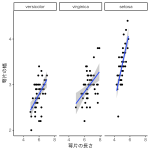
Speciesの順番が変わりました。
以上です!